In this smartphone revolution, the number of mobile users has increased rapidly because most people are browsing the internet via smartphones or tablets. Users are spending more of their time on mobile rather than using the desktop for surfing. So Creating a mobile-ready responsive menu is a very important step to ensuring your website looks & functions. Sometimes when we see some websites on smartphones their menu items don’t look perfect.
Navigation helps people navigate through the important pages of your website and is an important part of a user-friendly website. Making it a mobile-ready responsive menu will make your mobile visitors happy and make them visit your site more often in the future.
This article will show you different ways to create a mobile menu on WordPress. We will cover both the plugin method for beginners and the coding method for advanced users.
Through this post, we will illustrate the same process of developing a mobile-friendly WordPress menu.
Likewise, we will represent to you both the plugin methods, namely, for beginners (which does not require coding) and the coding method for our advanced users.
Why Should Your Website’s Menu Be Left Beyond?
Not at all! However, the way the menu is displayed is a part of making the menu responsive. Therefore, if your primary navigation menu is in the form of a list on a desktop device, then the same menu can be displayed as a hamburger menu on a mobile device.
Although, to make the menu mobile friendly you’ll want to change the content i.e, displayed on the menu.
Benefits of Mobile Responsive Menu in WordPress
Indeed, a mobile responsive menu website is one whose page and elements can be viewed on any of the devices. However, such websites are of the utmost importance to increase traffic to a site.
Thus, to be entirely honest, it takes a lot of effort to make sure that a site works well on a mobile device. After all, there are so many browsers and resolutions to be considered.
Hence, for this issue, we brought easy ways to create a Mobile-Ready Responsive WordPress Menu.
Points To Remember While You Creating Mobile-Friendly WordPress Menu
So, before we get to the actual methods that will help you to create a WordPress menu. Let’s have a quick look at some usability tips for better catering to mobile users:
- Reduce The Number Of Menu Items: However, the better accommodate small screen devices, try removing non-essential items from your mobile-only menu.
- Minimize The Number Of Clicks Required: Further, the other option is to minimize the number of clicks required. Hence, try limiting the layers of your WordPress menu.
- Maximize Screen Real Estate: Finally, nesting, expanding, and contracting drop-down menus is a great method to avoid the white space problem. Hence, use the universal three-line “Nav Burger” icons to signal the menu locations.
Indeed a survey by Google stated that a bad site experience on a mobile device might hurt your perception of the brand.
Creating a Mobile Responsive Menu in your WordPress
Use Themes For Your Responsive Menu
However, this is one of the easiest methods to implement a stylish and responsive menu is by using the right theme over it. Today many developers will make it a part of the overall design of the theme.
Despite a few, not everyone will take the time to include responsive menus. Hence, to test whether your menu supports the responsive design follow the path Appearance area >> Admin Panel.
Moreover, search the icons to illustrate to you what the theme looks like on similar devices. The icons for this will be named as desktop, tablet, and smartphone. Hence, press either of the icons to represent what the theme looks like.
Thus, to illustrate a different menu on a mobile device. Then, your theme needs to allow you to develop a separate mobile menu. Thereafter, your website will be Mobile-Ready Responsive.
We have a list of four methods that are frequently used by our experts. Let’s start one by one-
Add a Responsive Menu in WordPress Using a Plugin
Well, the method is for beginners, however, this plugin method is often very easy and recommended. And it is so because it does not require any of the custom codings.
Consequently, In this method, we will create a hamburger menu that slides onto the mobile screen.
Furthermore, the very first thing you need to do is install the Responsive Menu plugin and then activate it.
If you found any problem in plugin installation and activation read our blog How to Install a Plugin in WordPress?
After the activation of the plugin, it will add a new menu item labeled “Responsive Menu” in the WordPress Admin Bar.
However, if the menu item labeled as responsive menu got added. Then, click on the same, and it will take you to the settings page of the plugin. Further, select the menu which you want to use for your responsive menus. However, needless to say, if you have not created a menu yet, then, you can create one by following the path as Appearance >> Menu.
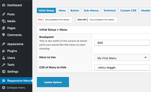
Finally, the last option on the screen is to provide a CSS class for your current non-responsive menu. However, It will permit the plugin to hide your non-responsive menu on a smaller screen.
Hence, remember to click the ‘Update Options” button to save your settings.
After that, you can go to your website and resize your browser screen to see the responsive menus in action.

Whereas, this option allows you to change the appearance and the behavior of your responsive menu.
Consequently, you can find these options on the settings page of the plugin and adjust them as per your requirements.
Now, start with the second method-
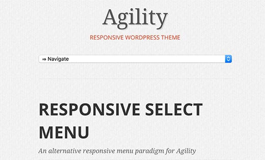
Add a Drop Down Select Menu Using a Plugin
Particularly, in this method, we add a drop-down select menu to create a Mobile-Ready Responsive WordPress Menu.
However, this method too does not require any coding skills. Therefore, it is also a recommended method for beginners.
Thus, the very first thing you need to do is install the Responsive Select Menu plugin and then activate it. Further, if you are not very aware of installing the plugin. Then, feel free to move along with our blog on How to Install a Plugin in WordPress.
Thereafter, you have to follow the path as illustrated Appearance >> Select. Following this path, you need to configure the plugin settings.
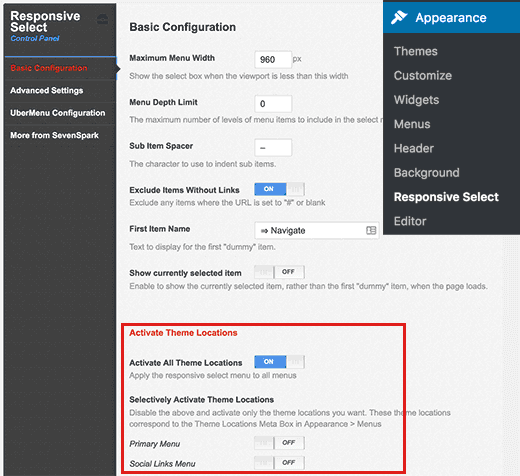
Further, you will require scrolling down to the “Activate Theme Location” section. Whereas, by default, the plugin is activated at all the theme locations. After that, the thing you need to remember is to click the save all settings button to save your changes.
Finally, you can move to your website and resize the browser screen to see the responsive select menu in action.
Now, move on to the third method-
Creating a Mobile-Friendly Responsive Menu with Toggle Effect
However, this is one of the most commonly used methods. To illustrate a menu on a mobile screen by using the toggle effect.
However, in this method, you need to add custom code to your WordPress files. If you have not done this before, have a look at our guide on Pasting the Snippet from the Web in WordPress.
Thereafter, you need to open a text editor such as Notepad and paste this code:
Code:
| ( function()
{ button = nav.getElementsByTagName( ‘button’ )[0]; // Hide button if the menu is missing or empty. if ( ! menu || ! menu.childNodes.length ) { button.onclick = function() { if ( -1 !== button.className.indexOf( ‘toggled-on’ ) ) { )(jQuery); |
Further, you have to save this file as navigation.js on your desktop.
After that, you have to open an FTP client to upload this file to the/wp-content/themes/your-theme-dir/js/ folder on your WordPress site.
Although, change your theme directory with your current theme’s directory. However, if you do not have a js folder in your theme directory, then, you’ll need to create it.
Consequently, after uploading the javascript file, the next step is to ensure that your WordPress website loads this javascript. Very often, you will have to add the following code to the functions.php file of your theme.
Code:
| wp_enqueue_script( ‘wpb_togglemenu’, get_template_directory_uri() . ‘/js/navigation.js’, array(‘jquery’), ‘20160909’, true ); |
Finally, we have to add the WordPress navigation menu to our WordPress theme. However, after adding the navigation menu to the theme’s header.php file save it.
| <nav id=”site-navigation” class=”main-navigation” role=”navigation”> <button class=”menu-toggle”>Menu</button> <?PHP wp_nav_menu( array( ‘theme_location’ => ‘primary’, ‘menu_class’ => ‘nav-menu’ ) ); ?> </nav> |
Also, we are assuming that the theme location defined by your theme is called primary. Whereas, If not, use the theme location as determined by your WordPress theme.
Hence, the last step is to add CSS (Cascading Style Sheets). So that our menu can use the right CSS classes to toggle to work when viewed on mobile devices.
Code:
| /* Navigation Menu */
.main-navigation { .main-navigation ul.nav-menu.toggled-on, // CSS to use on mobile devices @media screen and (min-width: 600px) { .main-navigation ul.nav-menu, .main-navigation li ul { .main-navigation ul li:hover > ul, .main-navigation li ul li a:hover, } |
Also, you may need to adjust the CSS depending on your WordPress theme. Therefore, inspect the element tool to detect CSS conflict with your theme.
Troubleshooting
Finally, you can go to your website and resize your browser screen to view your responsive toggle menu in action.
Now look over the last method used to add the mobile responsive menu in WordPress.
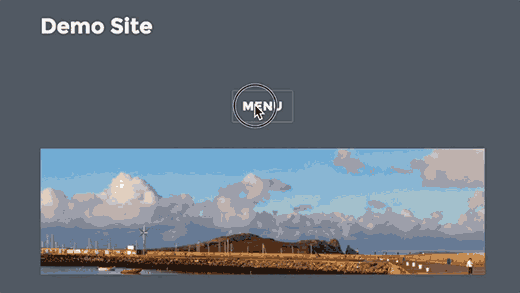
Adding Slide-In Mobile Menu in WordPress
However, another common technique for adding a mobile menu is using the slide-in panel menu (shown in method 1).
Whereas for method 4, you need to add code to your WordPress theme files. Conversely, this is a different way of accomplishing the same result as method 1.
Consequently, you will have to open a plain text editor like Notepad. And thereafter, add the following illustrated code to a blank text file.
Code:
| (function($) { $(‘#toggle’).toggle( function() { $(‘#popout’).animate({ left: 0 }, ‘slow’, function() { $(‘#toggle’).html(‘<img src=”http://www.example.com/wp-content/themes/your-theme/images/menu.png” alt=”close” />’); }); }, function() { $(‘#popout’).animate({ left: -250 }, ‘slow’, function() { $(‘#toggle’).html(‘<img src=”http://www.example.com/wp-content/themes/your-theme/images/menu.png” alt=”close” />’); }); } ); })(jQuery); |
As a matter of fact, don’t forget to change the example.com. Hence, despite of this use your own domain name and your theme with your actual theme directory. Further, save this file as a slidepanel.js to your desktop.
Thereafter, you will now need an image that will be used as the menu icon. Because a hamburger icon is used most often as a menu icon.
However, you will also find such images on different websites. Whereas, we will use the menu icon from the Google Content Icons library. And once you search for an image, that you want to use, save it as a menu.png.
Further, you need to open an FTP client and upload the Slidepanel.js file in the /wp-content/your-theme/js/ folder.
However, if your theme directory does not have a JS folder. Then, you have to create it and after that upload your file. Consequently, you must upload the menu.png file to /wp-content/themes/your-theme/images/ folder.
Hence, after uploading the file we need to make sure that your theme loads the javascript file. Which conversely, had been added and we get this by enqueuing the Javascript file. Thereafter, add the illustrated code to the functions.php file of your theme:
Code:
| wp_enqueue_script( ‘wpb_slidepanel’, get_template_directory_uri() . ‘/js/slidepanel.js’, array(‘jquery’), ‘20160909’, true ); |
Although, we need to add the actual code to your theme’s header.php file to show the navigation menu. Despite of this, you should look for such code as illustrated below:
| <?PHP wp_nav_menu( array( ‘theme_location’ => ‘primary’, ‘menu_class’ => ‘nav-menu’ ) ); ?> |
Moreover, you want to wrap the existing navigation menu with HTML code. Just to illustrate your slide panel menu on smaller screens.
code:
| <div id=”toggle”> <img src=”http://www.example.com/wp-content/themes/your-theme/images/menu.png” alt=”Show” /></div> <div id=”popout”> <?PHP wp_nav_menu( array( ‘theme_location’ => ‘primary’, ‘menu_class’ => ‘nav-menu’ ) ); ?> </div> |
Note that the Navigation menu of your theme is still there. Regardless, We have wrapped it around the HTML that we need to trigger the slide panel menu.
However, the final step is to add the CSS to hide the menu image icon on the larger screens. Also, you will need to adjust the position of the menu icon.
On the other hand, here we will show you a sample CSS that you can use as a starting point:
Code:
| @media screen and (min-width: 769px) { #toggle { display: none; }}@media screen and (max-width: 768px) { #popout { position: fixed; height: 100%; width: 250px; background: rgb(25, 25, 25); background: rgba(25, 25, 25, .9); color: white; top: 0px; left: -250px; overflow:auto; }#toggle { float: right; position: fixed; top: 60px; right: 45px; width: 28px; height: 24px;}.nav-menu li { border-bottom:1px solid #eee; padding:20px; width:100%; }.nav-menu li:hover { background:#CCC; }.nav-menu li a { color:#FFF; text-decoration:none; width:100%; } } |
Nevertheless, depending on your WordPress theme, you may need to adjust the CSS to avoid conflicts.
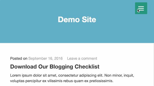
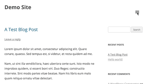
How it looked on our demo site:
Bottomline
We hope this post helped you to mobile responsive the same. However, If you have any problem or question related to this, tell us in the comment section provided below.
Additionally, If you liked this post, please share it with your peers.
You can contact our WordPress support team Dial +1-888-738-0846 (Toll-Free). Our WordPress customer service will always help you. We will happy to help you and solve your problem related to WordPress.
That’s all, thanks!
Read more blogs: