Design plays an important role in modifying your site as per the user’s interest. A bad design – bad Homepage design, in particular, can cause people to click “Back Button” in just a few seconds.
Here are 5 things that you should include in your site’s homepage to ensure whether your site is on a right track. Get your WordPress website designed by us to make it stand out among others.
1. An Attractive Header
The very first thing that a viewer catches in any site is the header. The header is the topmost area of your website where you’ve placed the name of your site. Your header will be displayed in accordance with the theme you’ve selected.
- In most of the themes, you just have to change the title and tagline text that you want and it’ll appear in the appropriate spot. Use the free Twenty-Thirteen theme, for instance:
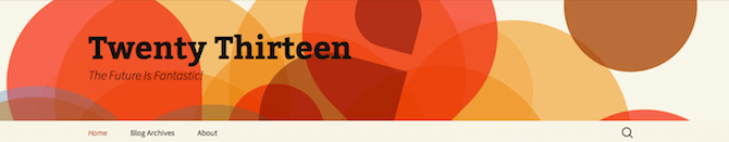
This theme is very easy but it provides you with enough space to show your site’s title and tagline. The background and graphics are actually attractive to take your viewer’s attention to the title and tagline.
- Another simple and free theme with great graphics is Baskerville 2 theme.
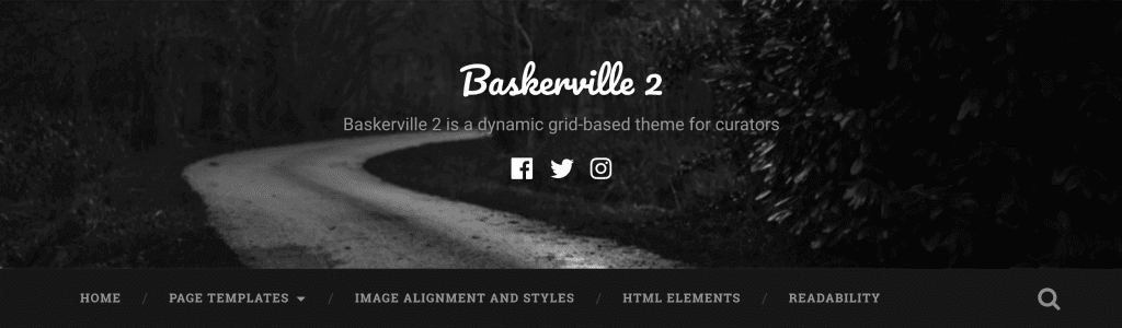
This theme not only display your titles actual front and center, but it’s also a parallax slider for an extra effective element. The graphics and background texture is also very attractive.
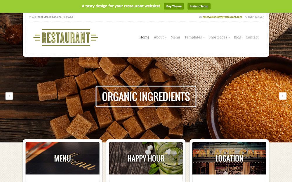
- A third and final example of excellent headers is from the Restaurant theme. This theme will cost you a fee but it offers an attractive header that suits the template.
All the above-mentioned themes have one thing in common that their headers can be completely customized. You can also fit your company’s logo or any other company’s related information in the header space by simply going to Appearance > Header and upload your file.
2. Consistent and Easy-to-Spot Navigation
The first thing the visitor look upon on a site is the header. Once it has been done right the visitor will look further into what the site is all about and where to go next. Here the navigation part comes into play. If your navigation is not user-friendly the visitor will bounce out of your site in a heartbeat. Usually, the navigation comes just below the header of your website as in case of Snap theme.
Some theme’s navigation appears on the left-hand side of the screen, like the Twenty-Fourteen theme.
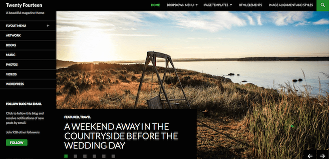
You can display menu items across the top, too, but the addition of the left navigation allows you to offer more menu options without overwhelming visitors.
Apart from the location of your navigation on your site, you also need to think about what pages you should be featured there. It doesn’t have to be just “About,” “Blog” and “Contact.” Rather, you can mix it up and include a menu link to your popular blog categories or a particular post.
3. Contact and Social Media
How can you receive feedback from your visitors? How can you expect to get new customers? The best way to help your customers is to let them get in touch with you by simply publishing a dedicated “Contact” page. For this, you can use the Jetpack plugin that has an included form module that’s super easy to setup and use.
Another good way to make it easy for people to get in touch with you is to add a text widget to your sidebar with a link to your email address. Also, make sure to include social media buttons or stickers on your site so that the people can connect with you across all of their accounts. As is the case in an example listed in a post on the Hot Off the Press blog:

You can also create some custom social media buttons that include design elements or colors from the rest of your site.
4. A Consistent Design
Your website should offer intuitive and straightforward navigation. All of the components of your home page should be in a logical place. The subjective elements, by their very nature, are a bit harder to pin down. Even so, you need to take out time to think about how the home page makes you feel, and will, in turn, make your visitors feel.
5. Surprise and Delight Your Users
Sometimes it’s just not a big deal to differ too much from the rule. Does that mean your website is condemned to blend into the crowd? Not compulsory.
While working on the most reactionary of designs there is a hope to surprise and delight users in such a way that your site is memorable.
CONCLUSION
By using a visually attractive header, clear navigation approach, outstanding contact info, and a good design, you’ll hook the visitors. You’ll get your best chance at turning them into customers. We hope that the above article helped you in making your homepage stand out in the crowd.
In case of any help talk to our WordPress Technical Support Team, Dial +1-888-738-0846 (Toll-Free). We will help you to resolve all your queries related to WordPress.