In WordPress terminology, a fluid layout is a special type of layout which is adjustable in the webpage when windows size changes. We notice this by calculating the pixel size of a page in the bottom area by its height and weight. As pages are like posts. Pages can be managed in a hierarchical structure in WordPress.
In other words, fluid layout CSS refers a way where WordPress designer design a theme. As CSS stands for Cascading Style Sheet. These are the documents which contain the styling rules that can be applied to HTML or XML, (along with some structural formats).
This enables the webpage to extend and contract the screen size of users. However, it differs from fixed layouts where each & every aspect of a theme has fixed width in pixels.
As theme is a group of stylesheets and templates that are used to describe the appearance and display of a WordPress site. A WordPress theme changes the layout & design of your site. Also, templates are those files which control how your WordPress site will be displayed on the Web.
Basically, when we measure a particular area of WordPress site like the header in an absolute number of pixels i.e. (740 pixels*192 pixels), we call it a fluid layout.
But, instead of this, a fluid layout design uses a proportional value such as 16:9 so that the webpage shown in a proper way.
Over to this, most of the webpage layouts include one, two, or maximum of three columns. In the early period of time, users have the same screen sizes. Web developers assign the page width size to find this. The fluid layout also defined by the percentage phenomenon of the sites.
When WordPress developers designing a site or WordPress theme, they have to decide to create a fixed or fluid width design. Typically, creating fixed-width designs are easy, but they have various flaws that are fixed by using a fluid layout.
In this modern era, most users have higher than 1024*768 screen resolution. That’s why there may be a lot of white space on either side of the theme’s content if it uses a fixed layout. For users, those use smaller screens or access your site on mobile, they may end up seeing a horizontal scroll bar as well.
Good news is that – A fluid theme in WordPress can solve a lot of problems that are related to multiple screen sizes but along with this it creates some of its own problems.
For example, with fluid layout CSS, no way to predict how to look your WordPress site. Apart from that, some image would not look good in case they are displayed at a different resolution or size. If the user’s screen is extremely large, the site can appear to look empty and unappealing.
The designer has less control over when the user sees content and images. It may require multiple widths to display on different resolutions. In case the user’s screen is extremely large, a lack of content may cause of fluid design to lose some of its appeals again.
Before sometime, sites are designed to be viewed in a desktop computer browser. Where all screen sizes websites (more or less) can be seen. But in this smartphone resolution, Responsive Development has grown in popularity. Nowadays, users can be viewing websites from a wide range of screen sizes.
This is similar to fluid layouts – The technique fluid layout with CSS is for designing a theme or site that is all devices and screen sizes responsive. As responsive means portability, it means – if your site has a responsive theme function then any user can view your site on the mobile devices also.
Benefits of Fluid Layout
The most benefit of a fluid layout is their accessibility. It makes more useful a browser for the WordPress. It is easy for the users to decide how much size they need for their sites. WordPress looks more effective by using it.
Further on, when the fluid layout is enabled, the complete site can be seen in the browser on all screen sizes.
Additionally, the fluid layout allows your site including header, footer, and main content to span across the entire browser on all screen sizes.
The setting of fluid site layout is under Appearance>>Customize>>Layout>>Container>>Site Layout.
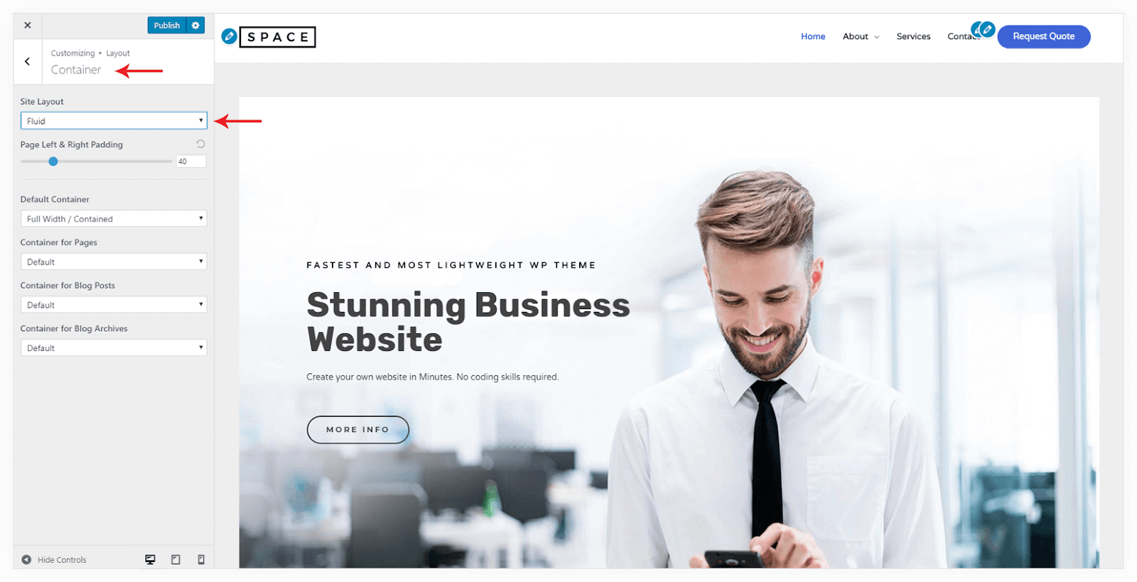
You can manage the padding on left and right. But on responsive devices, the padding is automatically adjusted.
For any queries related to WordPress Migration, you can contact our WordPress Technical Support team to avail our services. Dial our Toll-Free number +1-888-738-0846.