Unique, bold, interactive, playful, expressive – that’s how we could describe the use of typography in web design in 2021. The use of various digital effects in typographic systems is also called by many today an explosion of creativity on the Internet and a great way to revive your WordPress website who’s, on his part, upgrading from time to time with new versions.
What are the most current trends? We’re answering that question here, so stay with us. But before that, here are a few clarifications.
Basic Terms and Typographic Archetypes
When we say web typography, we mean the way we organize, style, format, and arrange text on a single webpage. This is preceded by the selection of a typeface and fonts for a specific project in the field of web design, whether it’s the creation of WordPress websites, personal websites, e-shops, web presentations, or applications.
When we say font, we mean letters, numbers, and punctuation and special characters created in a certain style, with a certain size and syllable weight. When we say the typographic system, we mean comprehensively all the typographic elements that were used on one webpage or a particular website.
San Francisco based artist and designer Elliot Dahl described the existence of 3 basic archetypes of typographic systems. Most companies use all of them in their web presentations, to a greater or lesser extent, but the essential difference between them should be kept in mind.
The archetypes of typographic systems are:
- Typography for a marketing website – with any website intended for the sale of products or services, certain parts should be emphasized by the use of effective but carefully blended fonts.
- The typography for the blog – the space intended for articles will take up the most space on the website, and the most important item when choosing a font will be its readability.
- Digital product typography – a product means software or a web application to solve a certain problem, and the selected fonts should follow the form and a certain hierarchy between the elements, but also to adequately connect instructions and available data.
It’s recommended to use a fixed system for structured components on the WordPress website, while a modular scale for selecting the font size is ideal for creating an optimal experience for blog readers or more extensive documentation.
Art or Science?
If you’re a web designer and you’re also an excellent typographer, would you describe yourself in one word as an artist or as a scientist? Jan Tschichold, one of the most influential designers in 20th-century typography, said that perfect typography is more a science than an art.
When we have in mind that we need to know the anatomy of the font and the possibility of adjusting the modular scales, but also that we need to study the so-called an equilateral triangle of a perfect paragraph (which consists of the length of the lines), the size of the font, and the height of the lines, we can also understand the claim that typography is a kind of science. In any case, carefully selected and skillfully incorporated typographic elements will undoubtedly contribute to the greater use-value of the website.
However, another question follows – is the content or appearance more important for the visibility of the WordPress website? Those who think that the content is more important, and most often in the form of text, have been smiling contentedly lately, knowing that text has entered web design through a big door and has become quite comfortable there. It often dominates by spreading across the entire webpage and clearly indicates that this is one of the latest typographic trends.
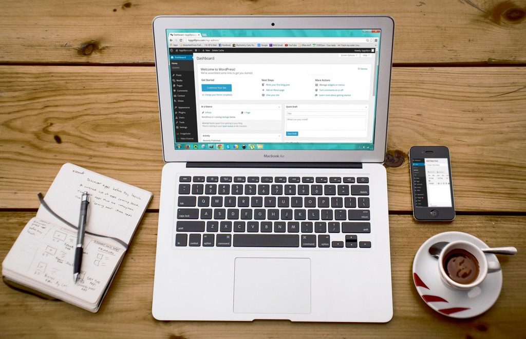
One more thing is important for the visibility of the WordPress site, and that’s web hosting. Database functions are important for managing the WordPress site. That’s where MySQL steps in.
Structured Query Language (SQL) is the management system for WordPress’ databases sending commands back and forth to retrieve information and execute operations. In view of this explanation, MySQL hosts, whose top plans have desirable uptimes and performance of a high calibre, are the most suitable for WordPress sites. The claim stands because MySQL hosts have features such as unlimited databases and phpMyAdmin for file management, which are of the essence for the proper functioning of the website based on the WordPress platform.
Let’s take a look at all the typographic trends in today’s world of web design.
5 Current Trends in Web Typography
1. Domination of the Text
If you think that the text on a webpage must be interspersed with images, videos, illustrations, or other elements that will break the monotony of the lines filled with letters – think again. Such an unwritten rule really applies in web design, because it will be easier for Internet users to notice top-quality photos than extraordinarily written text. But as Del Boy says in British sitcom Only Fools and Horses: “He who dares wins.“ Right?
Thus, those who are brave and courageous enough, decide to equip the complete website with letters, in large letters across the entire screen. In such cases, adaptive or responsive typographic elements are used, so that they look equally good on the display of a mobile phone and on the screen of a desktop computer.
2. With or Without Serif?
If the text entered the big door in web design, it would be said that the use of serif fonts on the small door crept back to the stage. Although serif fonts have always been present, it can now be said that they are in trend again. And they are stronger than ever before, as a bold version of the fonts is often used.
On the other hand, sans serif fonts are still highly positioned when it comes to choosing fonts for a project. Here, too, bold letters are used, most often those with an accentuated connecting stroke (spine) and a diagonal letter stroke. The reason for using letters without serif is their readability, but also the simplicity of fitting with other elements. So, whichever version you choose – you won’t go wrong.
3. Black on White/White on Black
Strong contrast is desirable in web design because it attracts the attention of visitors and focuses it on the desired elements of the website. And is there a greater contrast than that between black and white? The use of white and other light shades is becoming more frequent, and the trend of placing pronounced black letters on a white background and vice versa is especially noticeable.
The visual effect of such a design is really strong and can rarely fail to emphasize what is most important, and even to attract the attention of users.
4. Interactive Elements
It’s always interesting when the activity of dragging the mouse over a certain element (hover) causes a surprising effect on the website. The more original the effect you create, the better. An interactive design that includes text is often noticeable, so moving the cursor over a letter can make the whole word play, flicker, change the whole spectrum of colors, or start jumping, often accompanied by a certain sound.
From year to year, web designers go a step further in creating unusual interactive elements in typography, and we believe that this trend won’t become démodé so quickly.
5. Unique Fonts
When someone dedicates, for example, to create a project on the occasion of marking the centenary of the birth of Herb Lubalin, one of the most famous graphic designers (also called the king of typography), it’s logical that he/she will approach it in a unique way. This includes creating a unique font just for the occasion, as well as the specific use of web typography.
The fact is that every example of a unique design and original typography, purposefully designed with style (and meaning), won’t go unnoticed. That’s why the unique design hasn’t gone out of fashion for a long time and will be, it would be said, one of the most significant typographic trends for a long time to come.
For the end: There’s something else that will never go out of fashion, and that’s a well-tuned text that follows a certain rhythm along both the horizontal and vertical axes. In other words, always try to create a typographic arrangement that will be pleasant to watch, easy to follow, and easy to read. We leave the rest to your creativity and skillful handling of typography.