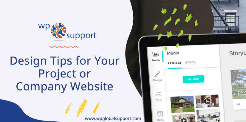
New projects, companies, and startups appear every day. At the same pace is growing concern about good website design and various web design tips to accomplish this, but it is still a process that needs to be much more developed in the minds of new entrepreneurs. Check out business WordPress themes for new entrepreneurs.
It is up to us, whether we are partners, owners or contractors, to show the importance and the solutions that a strategic design will do in the product and in the company.
So we selected some tips and possible adjustments that could be made to the project that is involved and will bring a good result in a relatively short period of time.
Web Design Tips
1. Mobile First
It’s been a while since the reality: most of the online traffic is through mobile devices. A website that is not responsive is not well accepted and often has only partial utility.
But today we have gone from the point of thinking of just adapting a great site (in terms of pixels) in small screens. Ideally, the smallest resolutions should be the main focus.
Another important factor is that Google indexes better-optimized pages for mobile devices (due to its mobile-friendly algorithm).
Thinking about this, and also in the strategy mentioned earlier, starting your planning for smaller versions enables you to create layout variations for larger screens much more easily than the reverse (big to small) way, saving you unpleasant surprises when you discover you need to delete blocks of content because they do not fit into smaller screens.
2. Less is more
This concept is still very important today, especially when it comes to design for websites.
Your WordPress website templates should prioritize what’s important: it needs to be lightweight and easy to interpret, so avoid a layout with too much distraction, visual pollution, unnecessary elements, and animations.
You only have a few seconds to captivate the attention of the user, so the most recommended is to use a clean, elegant, direct and objective layout. Stay focused on the important and relevant points of your business, with lightweight pages, well-positioned elements, and smooth navigation.
3. Look at the hierarchy of information
Planning is crucial for website design projects, and hierarchically organizing all the content that will be present on the site is part of that process. In other words, it is necessary to define the insertion of each element according to its order of importance. To facilitate understanding, we can exemplify this concept using the summary of a book.
It is in the summary that the reader finds the topics that are addressed in the work and, in order for the content to be clear and meaningful; the information must be organized in a coherent and hierarchical way.
The hierarchy will guide the user while browsing your site. Therefore, it must be thought strategically, ensuring that the actions make sense and have a well-defined goal.
4. Apply your business identity
As with all other touch points in your brand, you should also apply your company’s visual identity to the website. Remember that the visual identity system has as main objective to create a unit and a visual standardization, which facilitates the communication and the fixation of the mark by the consumers.
Therefore, elements such as colors, typography, graphics, and your company logo should also be present on your site, creating a consistent visual pattern.
5. Facilitate reading
The user needs to consume the textual content of the site easily and comfortably. Thus, one must be careful when choosing the sources of the texts.
Typically, it is best to define a standard typographic family for use throughout the website. If you see the need to use more than one source, apply it only to highlight some information, such as titles or quotes.
6. Facilitate navigation
Try to make browsing and easier on your website as easy as possible. Create a clear and objective main menu, use links strategically during the texts to complement the information and seek as much as possible to indicate the path that the user should follow.
If the site has a blog, or if it is a virtual store, it is very important that the categories and subcategories are well organized, so that people find what they are looking for in an easy way.
Other Points To Build Best Page Layouts
As you know that the page layout design has a variety of elements formatting, rearranging, and placement of elements too. Although most of the designer’s viewpoint see this whole process in its natural form. But sometimes they keep on trying their new ways to get a delightful end result.
However, this process can lead to some wonderful new outcomes. But it can be a little risky when you use a free-form of the methodology. Because it can lead to a lack of visual balance on the web page. Basically when you create a nice and eye-catching page composition.
Therefore it will also communicate to the key messages precisely to the expected audience. However, we will give you some great tips to make sure that your website’s designs and page layout have a good balance. Although these process will work so well to provide a structure for balance, no matter which medium you are using for it.
These points are as follows:
Always Keep On Research
Although before you start to develop any creative project. Therefore it is most important for you to understand the value of your website project in the great history of web page design and other art elements. So you should always keep on mind that never stop learning and researching about different styles.
In addition, contemporary or historical aesthetics, and movements should also be learned and research. However, the popular minimalist style of web design is an evolution of the aesthetic popularized by the early 20th-century design movement and German art known as Bauhaus.
Basically, it is drawing upon your own education. And also paying attention to what speaks to you personally. So that it will help you to develop a unique and relevant voice. Hence that will allow you to reference without ripping off the work you admire the most.
Therefore when you are starting a new project, refer back to the mood boards you have created. And also the images that you have saved over time. Besides that, if you do not have a mood board that feels relevant to your current project. Therefore you should make a new one, and take the time to understand the historical relevance of the direction.
Must Use Hierarchy
However, page layout structure and hierarchy is one of the best ways to create a attrective page layout for youe website. Although if you have already used the best structure. Then also it is necessary to carry the consequence of other different and useful pieces of content on your web page such as hierarchy of the content.
On the other hand, to understand it in a better way, a headline of the page is much more important. Thus it is always should be look more enhaced than the other text content. Therefore you must keep an eye at the different elements. That can help you to build up your best layout design.
Also, they can help you to decide which element is the most important one for you web page layout. After that, use should this that element to build a structural hook for the rest of the elements on your websites page. However, keeping them is the most important decision for amazing page layout.
Rule of Thirds Can Help
Although when you use the best and aproaches such as Rule of Thirds or Golden Ratio. Then it makes your page layouts more attrective. All you have to do is simply apply the rule of thirds on it. However, this rule says that if you divide the page of your site into thirds in horizontal and vertical manner.
Then it will give you the natural focal points of a composition at those points where the lines of the grid intersect each other. Although it is one of the best way to provide a sense of balance to your page layouts. Certainly you can do so just by aligning the key elements at these four points.
Besides that, you will get a more advanced page layout composition than what you have currentely. So that you can perfectly centre all the elements on your web page. However, this rule of thirds will not make your page layout in balance automatically or magically. Rather then as per the rules and principles you will have ease.
While you use this process towards a natural focal point of your page then it will help you to inform the balance of your page layout. Although its a common approach that can help you a lot. That is just place the most important elements of your page either in the upper or lower third of the page. And the primary focal point must be aligned to match with one of those intersections.
Repeat The Design Elements
However, the repetition of the design elements can also give you the strong page layouts. Also, it can give you the required balance to a page composition and sense of connected design. Basically the idea behind it is that when you reuse and identify the page design or page layout.
Then you can give a reference to your readers so that the disparate areas also feel connected and seems like part of the same overall composition. However, you can also use this method to give a focal point in your design. While by intentionally breaking the pattern of similarity you can retain an overall balance that introduced through repetition.
Apply The Grid System
Although if you want to make one of the best page layouts for your own website then you must have to use a grid system. Because these grids can be used as the sole that is preserved for the printed page of your site. But there is a lot of work that has already been done online in the last few years. These all can help you to migrate the idea of these grids over to the digital medium.
However, you can inform the location of all the different elements on a page of your website just by using a grid system to it. Certainly, you will be able to create a connection between the many types of elements that can build up your web page. However, this process can help you to provide a sense of order to the page layout of your website.
Therefore it will provide a very clear and structural reference to the reader of your website so that they can come back on the main page. Therefore it is one of the most comfortable ways. That ensures your web page has a good degree of page balance. Also, it is much important because when all of the web page elements of your site have a feeling of connectivity with each other.
Then the overall effect of your website may feel a little more convenient to the reader of your website. In addition, it can help them to give ease of user experience. Besides that, you can be helping them by making their access to the important stuff of the content.
Utilize Contrast and Scale Option
Basically, it can be a highly useful method if you use the scale that can also help you to get a great visual balance within the page layout of your website. However, you can do so just by making a few elements quite larger than the others. Therefore the sense of hierarchy and correct order will develop to your web page layouts.
In addition, it can help you while creating some of the comfortable page layouts. Because when the viewer of your website will see at the larger elements within the page layout automatically. Therefore at first it progressing through to the smaller size elements of your web page as they read.
Although this basic principle will also work with the increased contrast. So that just by isolating an element on the web page your website through the contrast will definitely make the readers eye focus on that point first. However, this can provide a way into the web page. Also, then it provides you a beneficial structural point again.
So that it can help you to develop your page layout. However, contrast and scale both work best when they apply to any one element. Thus it makes them stand out from the other parts of your web page layout. You can also use the principles of harmony for it just to make others feel connected and emphasize the focal point.
Must Apply A White Space
Well, it is very well-known for those web designers who are new to this field. Therefore they keep an eye and make the use of each and every single bit of available space on a web page of the website. In addition, they usually like to do stuffing in the content until each and every gap within the web page has been filled effectively.
Besides that, some of the more experienced developers already know that sometimes the most suitable bit of web page design must involve a few leaving elements out, rather than get them back in. However, into the printed medium, there is a process of enlarging the gutters and the page margins.
This process is called the most common way to make better use of white space. Although if you want to do so on the web. Then all you have to do is just simply provide a lot of free space around the elements. So that it can definitely help you to make your web page layout design more composed and feel balanced too.
However, you can use the negative white space. This space can be work as the best when you have a clear structure. Abd that structure anchors the content together with the same as provided by a grid element. However, if introduced haphazardly then as the risk of the space it can be just a sense of disconnection between the page elements.
Take A Single Focal Point
Although it is always a good idea when you decide to select a single focal point for the web page layout design of your website. In addition, it is a quite good example of the basic practice that is the use of a large image as the biggest size single element on the web page of your site.
However, a powerful visual can also provide you a strong way. So that you can lead the reader of your website into your web page. And also it supplies the very useful structural element around. That can help you to arrange all the remaining content in your web page layout.
Although if you have more then one visual element. Therefore it can use the proximity principle of Gestalt Theory. So it will help you to group them together. And also arranging them all in the same way. Thus it is also one of the most effective ways that can provide a sense of balance within your web page layout.
Besides that, this is worth keeping into the mind that you are able to use a headline or you can also pull a quote into the same way. However, a good display headline can also offer your readers as much visual interest as an image. While you can continue to provide them the structure that will help you a lot to make sure a balanced web page layout.